Boom-shocka-locka.
I have no idea how to start up my newly re-purposed DIY Dork site (now with a fresh new wordpress smell!) … so why not start with the biggest project my wife and I have ever tried to redo.
We bought a barn!
(…house)
A pretty ugly one too.
But the “bones” are good and it’s gonna be pretty cool once we redo it. All of it.
Every $ingle $urface of it.
So why don’t you let me take you on a journey through the house with some pics.
First, close your eyes.
Ok, now imagine you’re in 1976, you live in the middle of Missouri, and you want to build a house. Oh and you have really bad country kitsch taste. So you decide to showcase it all in a barn shaped house.
Welp, open your eyes and this is what you get:
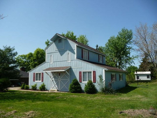
The Outside
This is the original picture of the house I found while looking through all the real estate sites. From 50 feet away on a sunny day… it looks all bright and cheery! We thought, “Ok… cool, this place is unusual and has some character. We could do a little sump’n sump’n with this”.
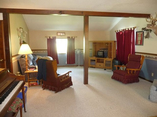
The Living Room
And then just like that… we realized how sad this place really was inside. There’s just so many things going on in this pic. Take a minute to absorb it all.
The furniture!
The dust ruffles on the furniture!
The dark brown ’70s trim!
The miniature TV in the big ‘ol entertainment center!
The big TV on the floor!
The wallpaper!
The wall border!
The other wallpaper!
The curtains!
The deer head and fish!
Oh wait… and there’s no lighting in there other than Grandma’s lamp/side table/magazine rack ?!?
What a beauty!
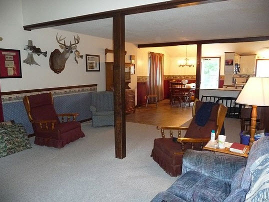
The Living Room / Center Room / Dining Room
Oh hey… there’s actually 2 fish guarding the deer head! … but why does the wall paper, border, & chair rail just end in the middle of the wall?
Man oh man, the ugly was spread out everywhere.
Also, notice that big hutch against the wall near the dining room. It’s blocking the weirdly designed front door that barely opens. I think there’s a quilt rack hanging above that door too … umm?
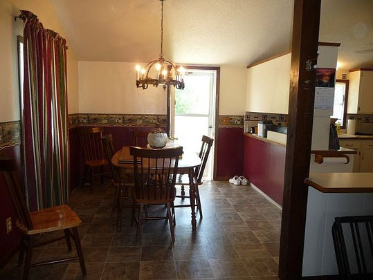
The Dining Room
The dining room seemed half decent compared to the rest of the house. Until you really looked at it up close.
See that wall border? It’s printed with a scene of fields and barns. It was masking another layer of old wall border along with some of the worst dry wall mudding I’ve ever seen on a wall.
And that hanging light? It had little brass grape clusters all over it. I hit my head on it so many times, I’ve lost count.
The cherry on top is definitely the view of the kitchen from the dining room. I called it the “Seinfeld Renovated Kitchen” view.
In case you need a refresher:
The Kitchen
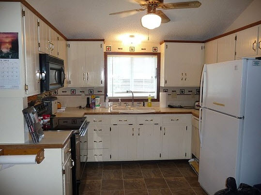
Mmm. Nothing says welcome to our barn like an old country kitchen and a grease soaked popcorn ceiling.
The kitchen looked ugly in these real estate pics. We figured that we could use it as is for a while, and then redo it later. Wrong. It was gross, gross, gross.
The popcorn ceiling was falling into the sink.
There was a layer of grease everywhere.
The particle board cabinets were soaked & moldy.
The dishwasher was falling apart.
Oh, and the upper cabinets had old nursery rhymes decoupaged inside. For reals.
It needed help desperately.
The Back (Drum) Room
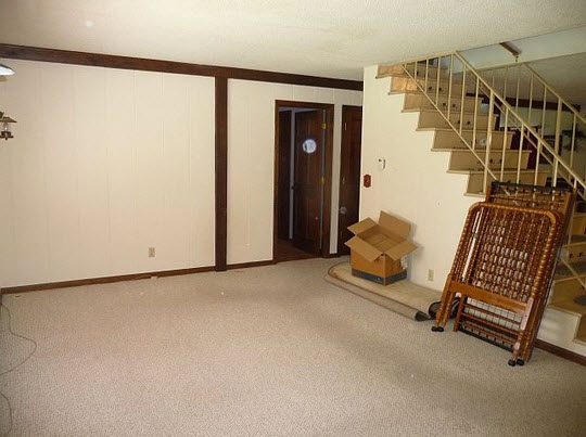
The backroom looked half decent too. You know, just clear the junk in it, paint the walls, put a drum set back there, and it’d be done.
Nope. The walls were made from old 70’s paneling.
The knots were falling out and they were completely warped & rotten from the leaky, huge window just to the left of view.
We were going to have to replace all the paneling with drywall.
Oh, and there was no lighting in here either except for two lantern styled wall sconces on each side of the window.
The Downstairs Bedroom
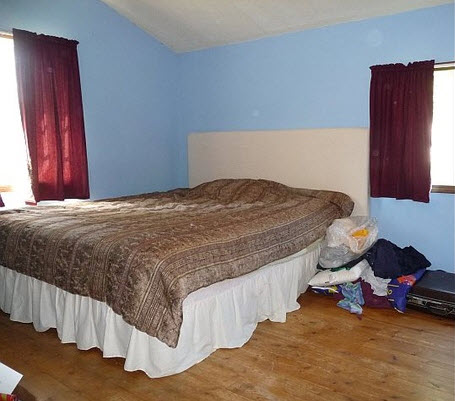
This bedroom didn’t seem too bad. A tall ceiling and wood floors… seemed hopeful. This will be the future DIY Dork project headquarters.
From the real estate pictures, we couldn’t tell where this room was. Turns out, it was downstairs (through that doorway seen in the back room picture above).
Hey, no carpet! Bonus points.
We figured this was another “repaint & you’re done” kinda room.
It almost was.
It was just filthy & the floors needed to come up. They were really beat up.
They left that headboard hanging on the wall. I have never seen anything with so much dust on it before. Pretty nasty.
The windows sucked & the popcorn ceiling was gross too. It still ended up being one of the easiest rooms to redo.
The Bigger Upstairs Bedroom
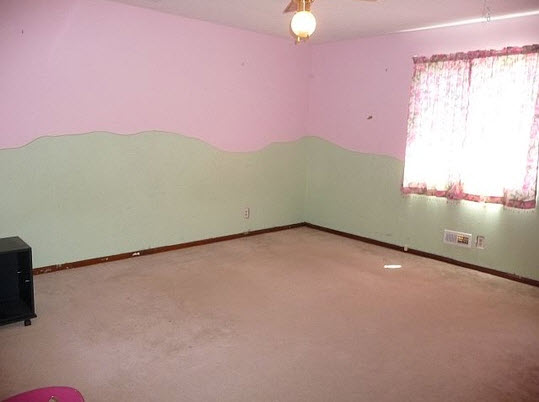
This bedroom upstairs didn’t seem too bad either. Looks like it was a girl’s room with a cutesy landscape paint job at one point. It looked like an easy fix. Pull the carpet & trim, repaint… boom, it’s done.
Ugh, yeah right.
Once we got an up close look at it… we discovered that the “landscape” wall painting was actually 3 dimensional! Someone GLUED acoustic ceiling tiles to the bottom of the wall way back in the day, and now it had layers of paint holding it on even more.
What a disaster. I’ll post some more gruesome pics of it later… but it turned into a full re-drywall job in that room.
The Smaller Upstairs Bedroom
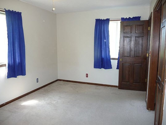
The smaller bedroom upstairs seemed like the cleanest room in the place. It will be the future DIY Dork office.
The second, smaller bedroom upstairs was in similar shape to the bedroom downstairs. Nothing too crazy on the walls (no ceiling tiles glue to them… but they did have visible brushstrokes of a big flower bed all around the lower perimeter.)
But compared to all the other rooms, this one was gonna be an easy fix. Do Board & Batten on the ceiling, swap out windows, replace trim, & repaint the walls and doors. This will eventually be our office where I’ll be able to do all my computer/internet work with no distractions (except for the nice view out the windows).
The Basement
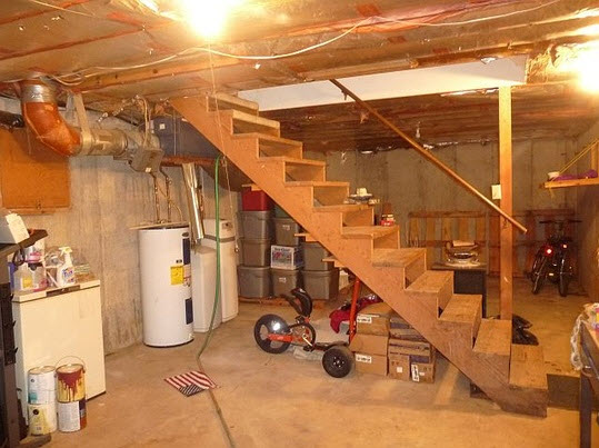
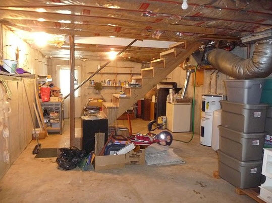
The front half of the basement. (That Power Wheel thingy would have been included in the purchase price if I were 9 years old again)
Come from out apartment, the basement was a really nice bonus. Look at all the potential storage space for all my diy project tools and junk!
But why did they have stuff in plastic containers on top of pallets? Hmm.
Within a couple weeks of owning it… we knew why. It leaks … oh, and the SPIDERS! It flooded about 2 inches after a heavy rain one night. We bought a little slump pump and got rid of the water (after trying to shopvac it out for about 4 hours). I snaked the floor drain, & now any water that might get in goes right down.
Ok, So Something Was Missing in the Real Estate Pics
Shouldn’t this house have a bathroom? Why no pics?
This is why!
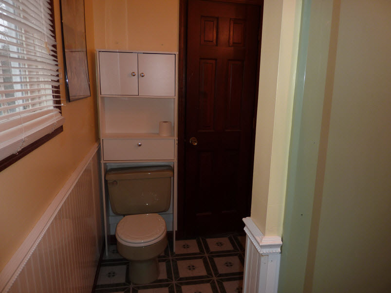
Downstairs Bathroom
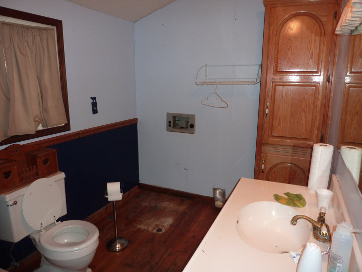
I shudder when I think about the condition of the downstairs bathroom. It was CREEP-TASTIC. I’ll show more pics later, but on the wood floor in front of the sick … I mean sink… it looked like someone was murdered & bleed out.
By the way, who puts wood floors in a bathroom?
The popcorn ceiling was falling into the shower.
The brass faucets were turning fuzzy green.
The walls were actually painted over wall paper (& were bubbling off).
The shower leaked & the toilet creaked.
It was bad. It just really creeped me out to go in there. Plus it was located directly next to the kitchen. Kind weird, but whatever.
Oh… and don’t let me forget… those beige curtains seemed to weigh about 15 pounds! I think they used to be white, but soaked up years and years of poop particles.
We decided to make sure to start redoing it before anything else.
It said it was a 2 bath house. What’s the second bathroom look like?
Upstairs Jack & Jill Bathroom
Surprise! It’s ugly too!
The small upstairs bathroom is a Jack ‘n Jill style connecting both bedrooms.
Everything in there is basically 1976 dark brown or 1976 pea soup green. Yum.
We decided to leave it alone while we’re redoing the house, so that we have a clean area to change, get water, & use for #1 & #2 (or even #3 accidents… hey, everyone poops).
The ceiling is falling in and everything is worn out. The “updated” work done in here sometime in the past is really shoddy too.
We’ll redo it later.
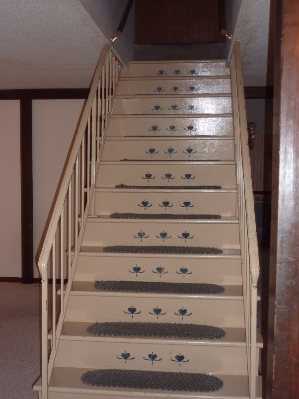
The Sad Staircase
It’s no wonder they didn’t show pics of the stairs while trying to sell the house.
They were ugly and depressing.
Beige steps, beige railing, faded blue heart stenciling, and stapled down, cat hair infested rugs!
The nice thing though, was that they were wider that most staircases. We’ll repaint & eventually put up some better railings.
The drab beige has to go though.
The Truth About the Exterior
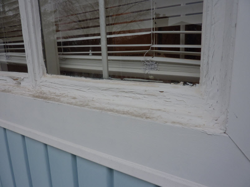
The house looked like it was in nice shape from the pictures. But up close? It’s pretty rough around the edges.
The inspector told us that the windows had to be replaced as soon as possible.
And looking at these pics… it looks like the previous owners owned stock in silicone caulk!
The windows were single paned units from ’76 and were leaking like crazy. The walls underneath them were starting to get soaked.
We’ll have to replace windows & put up some temporary trim now, and then later down the line, we’ll modernize the exterior.
Wrap Up
So that’s pretty much what we saw when we first found the place. It was ugly… but it was so unique & open, we knew it had tons of potential.
I’ll post links throughout this page to updates we make to everything as we go.
It’s gonna needs TONS of work on EVERY surface… but it’ll be cool.
– Kevin

Whoa! That’s country. Not that there’s anything wrong with that.
Yep, it was very dirty, mismatched, & outdated country.